Everyone loves a good trend. We see a color that’s fresh and new, and we’re instantly drawn to it—we can’t help it. But the problem comes when you buy into one of these trends without really thinking about how you’ll feel about it later. A lot of times, this is a trend that doesn’t look good in your home, or you don’t have the right furniture to pair it with. Sometimes it’s just not something that’ll grow on you. It’s important to think ahead, especially when you’re spending money on things like interior paint color —you can get a quart of paint for around $25, so you want to make sure that when you do buy it, you’re going to be able to use it in more than one room if necessary.
Selecting the right color scheme is one of the most important parts of interior design, but also one of the most difficult; there are so many options out there!
Color trends are always in flux, with all the hues that decorators and designers dream up. But sometimes you see a color so beautiful, so perfectly executed, that you can’t help but think it’ll be timelessly beautiful forever. And then, as soon as you get used to it, the look dies—and it’s generally a long time before we see something like it again. But to keep our favorites around for a little bit longer, here are 12 paint colors we love in 2022—plus some tips on how to use them in your home now or in 5 years.
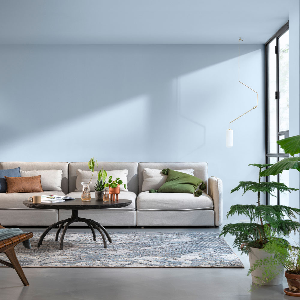
Serenity
The paint color Serenity Blue was a popular choice among interior designers in 2022—and if you love this look, it’s not too late to give your own home a fresh coat of that shade. The year 2022 saw a return to earthy tones and soft hues, with lighter blues being used in living spaces as accents rather than dominating the whole scheme. A simple way to freshen up your decor for this trend is by swapping out the hardware on cabinets and doors from brushed aluminum to gold or brass. In bathrooms, shower curtains and accessories like soap dispensers and toilet paper holders in muted versions of this shade add sophistication without overpowering the space or calling too much attention to themselves. And while it wasn’t a main focus of the style, we did see plenty of bathrooms where designers pulled it off well by using serenity blue as an accent against white tile or wood cabinetry. If you’re ready to add this color to your home’s design, there are plenty of ways to do it—here are just a few ideas to get you started!
Seabreeze
From the living room to the bedroom, from the kitchen to the bathroom, Seabreeze is a color that makes us smile every time we see it. It’s the perfect shade of blue to instantly refresh any space that you put it in, whether it’s a room in your home or an office on the other side of town. Of course, this variety of blue isn’t particularly new to interior design—it’s been a classic favorite for decades. But don’t be surprised if you start seeing more of it in just five years: according to our prediction algorithm, Seabreeze will be making a comeback and will be one of the hot shades in 2022.
Programmed with data from top interior designers and paint companies, our color-forecasting algorithm uses machine learning to uncover patterns in trends. It takes into account factors like current popularity and how much a certain hue is being used across different states and countries when determining which hues are about to become household favorites five years into the future. And for those who want their homes to be on trend now, we’ve analyzed its popularity in recent years and from where it is being used most to predict which areas will see growth over the next few months.
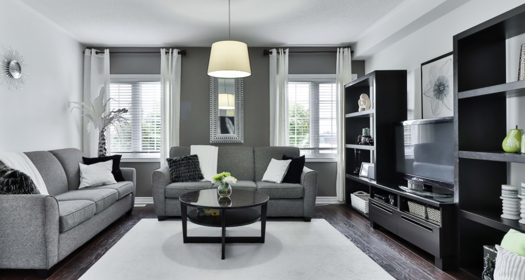
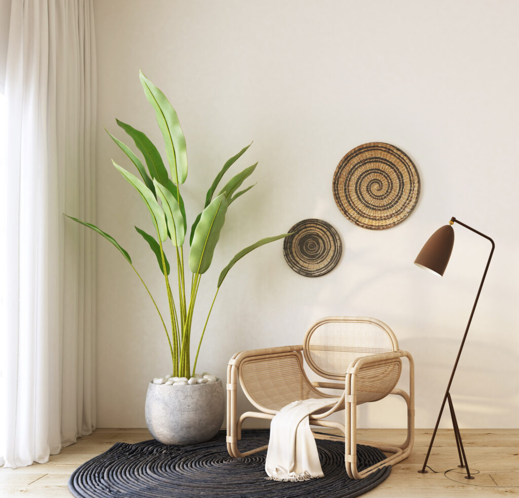
Earl Gray
The color earl grey is a classic. It’s elegant, and it feels like a lovely respite from the ordinary. There’s something about the warm, mellow earthiness of this hue that evokes a feeling of home and well-being. In the home decor world, the shade has been featured in everything from walls to rugs to cabinets, and it looks as beautiful today as it did back, when it first started appearing in interior spaces.
The shade of earl grey is a unique color that blends cool tones with warm ones; though it ends up looking grey in most light, the creamy variations of it make it feel like more of a neutral beige than anything else. Over time, the color has moved from being used solely for walls to being featured in decor items such as furniture upholstery and rugs. Today, the color earl grey can be found in everything from home accessories to clothing and jewelry. It’s a timeless color that feels warm and inviting, and its sophisticated prettiness makes it ideal for any room in your home that you want to feel extra special or luxurious.
Naive Peach
The color of summer and the perfect accompaniment to a crisp, white sofa, naive peach has all the right things going for it—it’s light, it’s bright, and it’s cheerful. Its cheerful nature is what makes this color so appealing, which is why it’s appropriate for just about any room in your home. From living rooms to bedrooms to offices, naive peach is a delightful option for your next paint job.
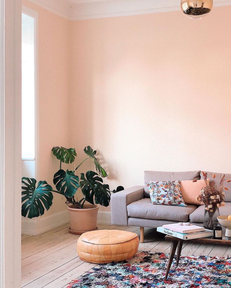
If your home (or office) isn’t already an oasis of peachiness, this color is the perfect way to inject some cheer into your interior design. Try painting the shower wall or vanity in this sunny shade for a fun pop of color on a daily basis. For a more long-term effect, paint your bedroom walls in naive peach and then complement it with a dresser painted in this hue. If you’re looking to have some fun with your bedding, try pairing naive peach sheets with black pillows and throw blankets—the contrast will add dimension and bring out the best in both colors.
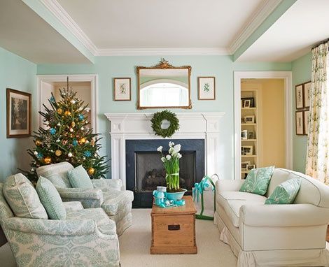
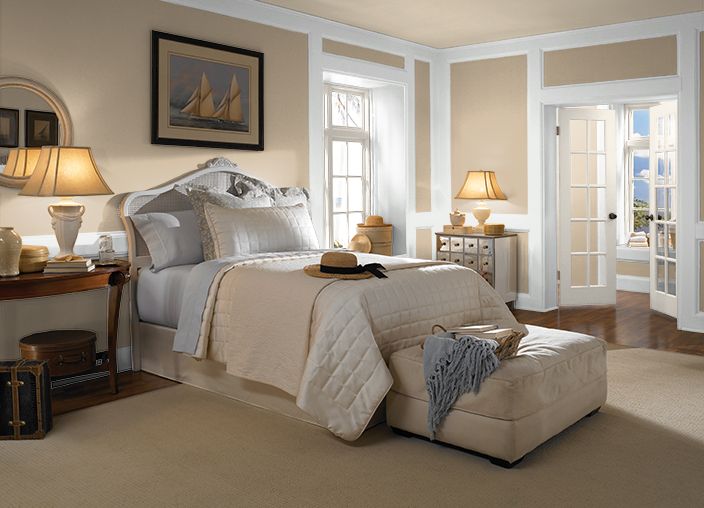
Cream
Cream is a soft, warm, and inviting interior paint color that is great for any room in your home. It’s one of those colors that goes with everything, so while it’s not a particularly bold choice, it will always reliably be in style. And what’s best about cream is that it only becomes more beautiful as time passes. Over the years, as wood furniture becomes more weathered and natural fabrics develop an attractive patina, a light cream color can look positively radiant.
Cream is also a great backdrop to get excited about mixing patterns and textures. It doesn’t compete with other colors or surfaces, so you can feel free to mix it with complementary colors like reds or blues, or go wild and use green-yellow-orange-purple as your main palette. You’ll always have something pretty to look at!
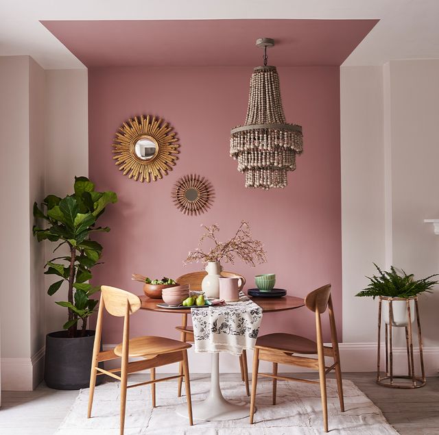
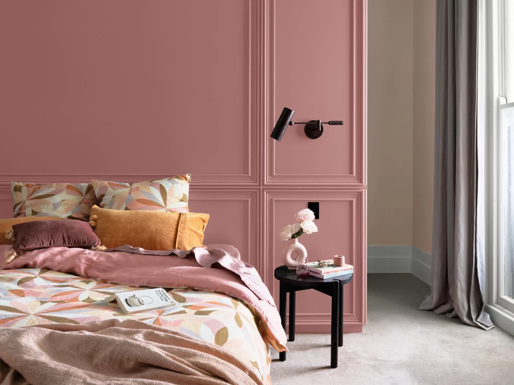
Rose
The warm, rosy tints of this color are so inviting and comforting—you could imagine the walls of a small cottage in the country, or a little throwback-style Airstream trailer. The deep shade of this color also offers a great blank slate for any kind of decorations you’d like to put up on it: a bit of plaid fabric here, some classic framed art there. It’s a classic look that’s made to last.
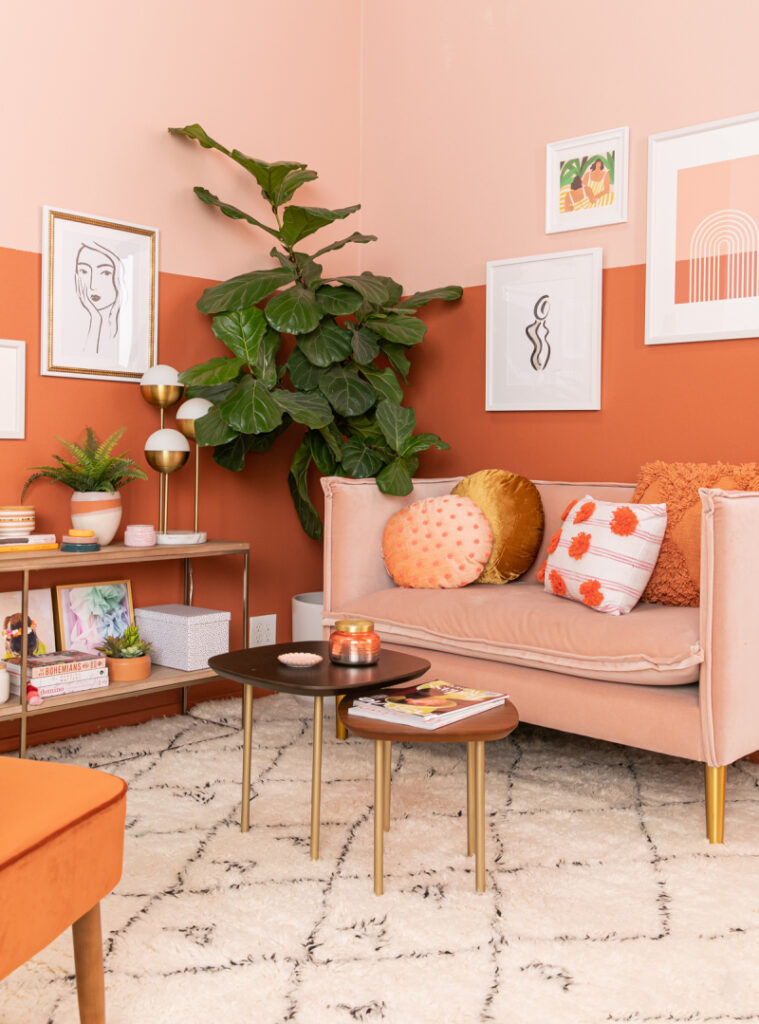
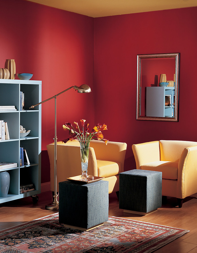
Million Dollar Red
The color red is not for everyone. Some people find it too aggressive or even gaudy, while others may associate it with strong negative emotions, like anger or pain. So when you’re picking an interior paint color, you might be hesitant to go with this powerful hue. But if you think that a room needs some extra zing, red might be just the thing to bring it to life.
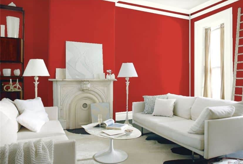
It’s true that there are many shades of red, ranging from light pink to deep maroon. Some of them might be much more appropriate in your home than others. A lighter shade of red can give a room a cozy and romantic feel; in fact, it’s often used in bedrooms for that reason. Meanwhile, darker tones are often found in more formal spaces—living rooms and dining rooms, for instance—but there’s no rule that says that a brighter hue can’t live there as well, especially if you’re looking for a fun pop of color. Just make sure that your red is the only one present in the room; if there are other colors present as well, they’ll likely clash with the brightness of the red and make the whole space seem jarring rather than exciting.
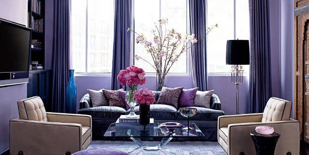
Lavender
When you’re working with a color as light and airy as lavender, it’s easy to end up with a room that feels too feminine to live in all the time. That’s why it’s key to take some of the fabric out of the equation. In this photo, there is a lot of texture and pattern, but it’s mostly coming from the furnishings. The walls are smooth and clean, which keeps the space from feeling like a lady’s boudoir and lets it be an appropriate backdrop for the rest of your home—and the occasional manly item that you want to display there.
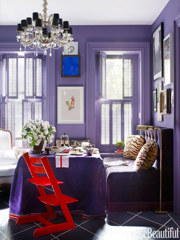
Don’t feel like you have to go all-out with wallpaper just because you have such a pretty color on your walls. In this case, going textured with just one element—the backsplash—makes for a more balanced look overall. The inspiration board does have a bit more pattern than what you’re seeing here, but even that is very subtle. If you want to add some extra layers without things getting too busy or overdone, consider an area rug or small woven throw blanket in a neutral or complementary color (like these options), or try something like nailhead trim instead of upholstered furniture.
Caramel
Caramel is a rich, warm color that almost always looks good. It’s great on its own as an all-over color, or it can be used as an accent to another color (for example, it looks lovely with yellow). Some shades of caramel are more brown than others—the lighter ones look great in rooms where you want a warm feeling without the heaviness of a darker brown. It works well for both masculine and feminine looks.
If you love the look of caramel, but are nervous about painting an entire room that color, there’s good news: you can play around with shades of caramel in smaller ways and still get a great effect. The caramel paint colors we’ve seen most often have had a “warm” undertone to them, meaning that they don’t have any blue or green in them. This makes them work well for rooms that already have warm colors like reds, oranges, yellows or earth tones—for example, if you’re painting your living room walls a deep purple or maroon shade. You can also use caramel in a room where you’re using light colors like white or greys, giving your space a touch of warmth. Just make sure to test out the shades in your space and see how it looks before committing to anything!
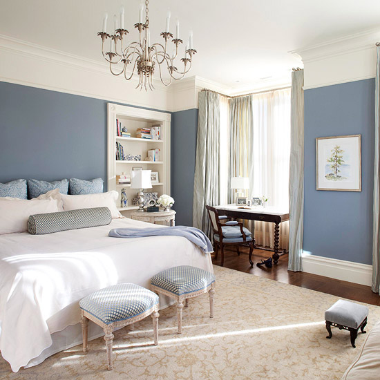
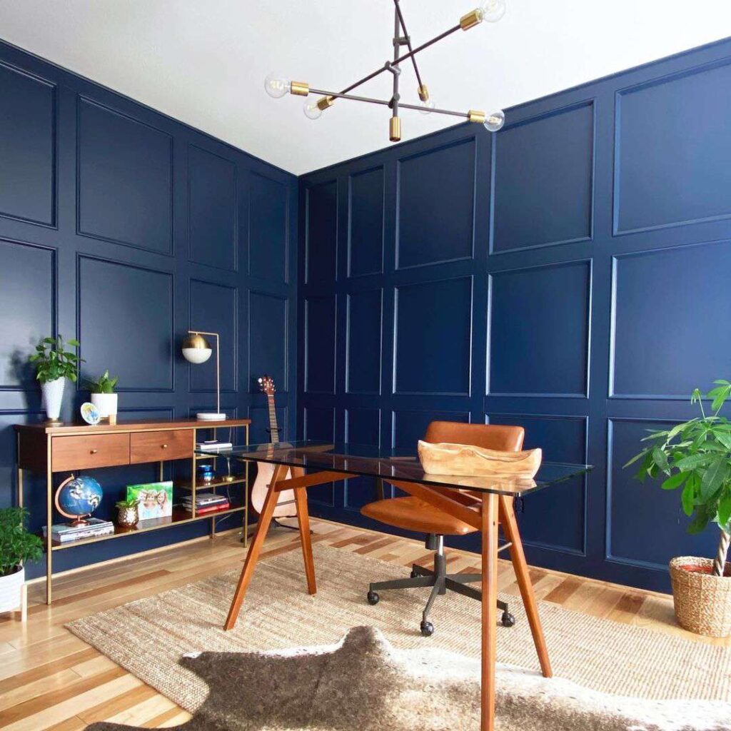
Navy
Picking the right navy blue paint color for your interior spaces is all about understanding what makes this shade of blue so versatile, and why it works in nearly every room of the house. The basic blue used in the interior of most buildings was created by mixing Prussian Blue with White. This is known as Navy Blue, which is probably where you get the name (you wouldn’t call it Prussian Blue because it’s not typically used outside). Navy Blue is a cool-toned color, meaning it has a bluish hue that tends to make things seem more subdued or quiet. It can give an elegant feel to a space, but it can also feel more serene and calming.
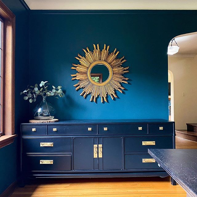
When you think of the color navy, you probably think of something big like a ship or an airplane (although some people might be thinking about football teams or car companies instead). That’s because Navy Blue is a big color—it’s got plenty of presence, and it brings its own energy into whatever room you’re using it in. You can use a bold navy for your walls to give an open office space a feeling of power and strength. In bedrooms and bathrooms, navy can help soften harsh lighting while giving off a cozy vibe at night.
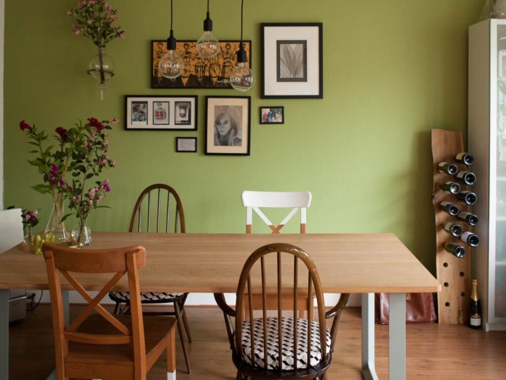
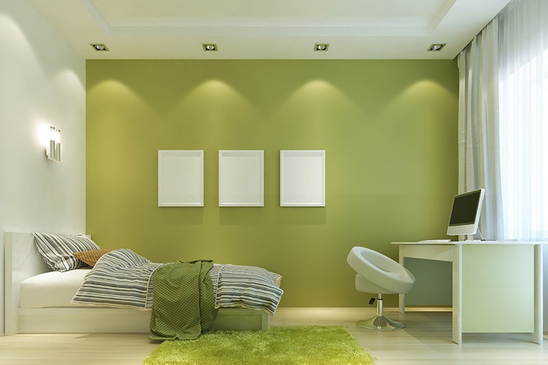
Olive
Olive is a happy green for those who are looking for a color that has a little bit of character and a lot of warmth. It’s actually one of the most popular colors in the world, and it’s another color that has actually been around since prehistoric times. This particular rendition is rich and saturated, but it won’t overwhelm a room. It’s warm enough to add coziness to spaces that need it, but it’s not so strong as to feel overwhelming in more open rooms. If you find that some greens can feel like they have an automatic “outdoors” vibe, this one is just right—it reminds me of mossy walls and trees standing tall against the wind. It’s evocative of the outdoors while still being indoors-y. I love it with white trim or walls and also with dark brown or grey furniture. Olive also pairs nicely with other earth tones like beige and ochre, as well as with pinks and quite a few shades of red. It even looks great with blues if you’re feeling creative!